diff options
Diffstat (limited to 'www')
| -rw-r--r-- | www/index.vto | 48 | ||||
| -rw-r--r-- | www/styles.css | 437 | ||||
| -rw-r--r-- | www/tufte.css | 31 |
3 files changed, 56 insertions, 460 deletions
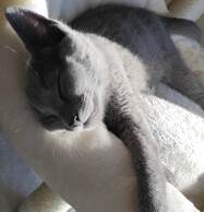
diff --git a/www/index.vto b/www/index.vto index b5e731e..41ce3fd 100644 --- a/www/index.vto +++ b/www/index.vto @@ -2,44 +2,53 @@ title: Mike Vink contacts: - href: /publickey.gpg - name: gpg - description: Send me an encrypted email. + name: GnuPG + description: Click me, trust me. - href: https://github.com/ivi-vink - name: github - description: I still use GitHub. + name: GitHub + description: CopilotHub? - href: https://stackoverflow.com/users/16349137/carrot-the-king name: stackoverflow - description: I am a Lurker. + description: Nothing here, but I have one. --- <html> <head> <title>{{ title }}</title> - <link rel="stylesheet" href="/styles.css" /> + <link rel="stylesheet" href="/tufte.css" /> </head> <body> <header> - <h1>{{ title }}'s Webpage</h1> + <h1 class="webpagetitle">{{ title }}'s Webpage</h1> </header> <main> <article> <section> <header> + </header> + <section> + <figure class="centered"> + <a href="/picture-full.jpg"> + <img class="rounded" src="/picture.jpg" alt="/picture.jpg" /> + </a> + </figure> + <p> + <label for="sn-demo" + class="margin-toggle"> + </label> + <input type="checkbox" + id="sn-demo" + class="margin-toggle"/> <span class="marginnote"> - <figure class="rounded"> - <a href="/dunya-full.jpg"> - <img src="/dunya.jpg" alt="/dunya.jpg" /> + <a href="/dunya-full.jpg" > + <img class="rounded" src="/dunya.jpg" alt="/dunya.jpg" /> Dunya </a> - </figure> </span> - </header> - <figure class="rounded centered"> - <a href="/picture-full.jpg"> - <img src="/picture.jpg" alt="/picture.jpg" /> - </a> - </figure> - <p> - Well Met Netizen! I am Mike Vink and this is my webpage. + Welcome, O, Surfer, I am Mike Vink and this is my webpage. + That blue russian cat there is dunya. + + </p> + </section> <h2>Contact Info</h2> <dl> <dt> @@ -59,7 +68,6 @@ contacts: </dd> {{ /for }} </dl> - </p> </section> </article> </main> diff --git a/www/styles.css b/www/styles.css deleted file mode 100644 index ed2ca0b..0000000 --- a/www/styles.css +++ /dev/null @@ -1,437 +0,0 @@ -@charset "UTF-8"; - -header { - font-family: "Fira Sans",sans; - text-align: center; -} - -html { - font-size: 15px; -} - - -html, body { - height: 100vh; - padding: 0; - margin: 0; -} - -main { - width: 87.5%; - margin-left: auto; - margin-right: auto; - padding-left: 12.5%; - font-family: Palatino, "Palatino Linotype", "Palatino LT STD", "Book Antiqua", Georgia, serif; - background-color: #fffff8; - color: #111; - max-width: 1400px; - counter-reset: sidenote-counter; -} - -/* Adds dark mode */ -@media (prefers-color-scheme: dark) { - body, header, main { - background-color: #151515; - color: #ddd; - } -} - -.imgfig { - text-align: center ; -} - -.rounded img { - border-radius: 50% ; -} - -h1 { - font-weight: 400; - margin-top: 4rem; - margin-bottom: 1.5rem; - font-size: 3.2rem; - line-height: 1; -} - -h2 { - font-style: italic; - font-weight: 400; - margin-top: 2.1rem; - margin-bottom: 1.4rem; - font-size: 2.2rem; - line-height: 1; -} - -h3 { - font-style: italic; - font-weight: 400; - font-size: 1.7rem; - margin-top: 2rem; - margin-bottom: 1.4rem; - line-height: 1; -} - -hr { - display: block; - height: 1px; - width: 55%; - border: 0; - border-top: 1px solid #ccc; - margin: 1em 0; - padding: 0; -} - -p.subtitle { - font-style: italic; - margin-top: 1rem; - margin-bottom: 1rem; - font-size: 1.8rem; - display: block; - line-height: 1; -} - -.numeral { - font-family: et-book-roman-old-style; -} - -.danger { - color: red; -} - -article { - padding: 5rem 0rem; -} - -section { - padding-top: 1rem; - padding-bottom: 1rem; -} - -p, -dl, -ol, -ul { - font-size: 1.4rem; - line-height: 2rem; -} - -p { - margin-top: 1.4rem; - margin-bottom: 1.4rem; - padding-right: 0; - vertical-align: baseline; -} - -/* Chapter Epigraphs */ -div.epigraph { - margin: 5em 0; -} - -div.epigraph > blockquote { - margin-top: 3em; - margin-bottom: 3em; -} - -div.epigraph > blockquote, -div.epigraph > blockquote > p { - font-style: italic; -} - -div.epigraph > blockquote > footer { - font-style: normal; -} - -div.epigraph > blockquote > footer > cite { - font-style: italic; -} -/* end chapter epigraphs styles */ - -blockquote { - font-size: 1.4rem; -} - -blockquote p { - width: 55%; - margin-right: 40px; -} - -blockquote footer { - width: 55%; - font-size: 1.1rem; - text-align: right; -} - -section > p, -section > header, -section > footer, -section > table { - width: 55%; -} - -/* 50 + 5 == 55, to be the same width as paragraph */ -section > dl, -section > ol, -section > ul { - width: 50%; - -webkit-padding-start: 5%; -} - -dt:not(:first-child), -li:not(:first-child) { - margin-top: 0.25rem; -} - -.centered img { - display: block; - margin: auto; -} - -figure { - padding: 0; - border: 0; - font-size: 100%; - font: inherit; - vertical-align: baseline; - max-width: 55%; - -webkit-margin-start: 0; - -webkit-margin-end: 0; - margin: 0 0 3em 0; -} - -figcaption { - float: right; - clear: right; - margin-top: 0; - margin-bottom: 0; - font-size: 1.1rem; - line-height: 1.6; - vertical-align: baseline; - position: relative; - max-width: 40%; -} - -figure.fullwidth figcaption { - margin-right: 24%; -} - -a:link, -a:visited { - color: inherit; - text-underline-offset: 0.1em; - text-decoration-thickness: 0.05em; -} - -/* Sidenotes, margin notes, figures, captions */ -img { - max-width: 100%; -} - -.sidenote, -.marginnote { - float: right; - clear: right; - margin-right: -60%; - width: 50%; - margin-top: 0.3rem; - margin-bottom: 0; - font-size: 1.1rem; - line-height: 1.3; - vertical-align: baseline; - position: relative; -} - -.sidenote-number { - counter-increment: sidenote-counter; -} - -.sidenote-number:after, -.sidenote:before { - font-family: et-book-roman-old-style; - position: relative; - vertical-align: baseline; -} - -.sidenote-number:after { - content: counter(sidenote-counter); - font-size: 1rem; - top: -0.5rem; - left: 0.1rem; -} - -.sidenote:before { - content: counter(sidenote-counter) " "; - font-size: 1rem; - top: -0.5rem; -} - -blockquote .sidenote, -blockquote .marginnote { - margin-right: -82%; - min-width: 59%; - text-align: left; -} - -div.fullwidth, -table.fullwidth { - width: 100%; -} - -div.table-wrapper { - overflow-x: auto; - font-family: "Trebuchet MS", "Gill Sans", "Gill Sans MT", sans-serif; -} - -.sans { - font-family: "Gill Sans", "Gill Sans MT", Calibri, sans-serif; - letter-spacing: .03em; -} - -code, pre > code { - font-family: Consolas, "Liberation Mono", Menlo, Courier, monospace; - font-size: 1.0rem; - line-height: 1.42; - -webkit-text-size-adjust: 100%; /* Prevent adjustments of font size after orientation changes in iOS. See https://github.com/edwardtufte/tufte-css/issues/81#issuecomment-261953409 */ -} - -.sans > code { - font-size: 1.2rem; -} - -h1 > code, -h2 > code, -h3 > code { - font-size: 0.80em; -} - -.marginnote > code, -.sidenote > code { - font-size: 1rem; -} - -pre > code { - font-size: 0.9rem; - width: 52.5%; - margin-left: 2.5%; - overflow-x: auto; - display: block; -} - -pre.fullwidth > code { - width: 90%; -} - -.fullwidth { - max-width: 90%; - clear:both; -} - -span.newthought { - font-variant: small-caps; - font-size: 1.2em; -} - -input.margin-toggle { - display: none; -} - -label.sidenote-number { - display: inline-block; - max-height: 2rem; /* should be less than or equal to paragraph line-height */ -} - -label.margin-toggle:not(.sidenote-number) { - display: none; -} - -.iframe-wrapper { - position: relative; - padding-bottom: 56.25%; /* 16:9 */ - padding-top: 25px; - height: 0; -} - -.iframe-wrapper iframe { - position: absolute; - top: 0; - left: 0; - width: 100%; - height: 100%; -} - -@media (max-width: 760px) { - main { - width: 84%; - padding-left: 8%; - padding-right: 8%; - } - - hr, - section > p, - section > footer, - section > table { - width: 100%; - } - - pre > code { - width: 97%; - } - - section > dl, - section > ol, - section > ul { - width: 90%; - } - - figure { - max-width: 90%; - } - - figcaption, - figure.fullwidth figcaption { - margin-right: 0%; - max-width: none; - } - - blockquote { - margin-left: 1.5em; - margin-right: 0em; - } - - blockquote p, - blockquote footer { - width: 100%; - } - - label.margin-toggle:not(.sidenote-number) { - display: inline; - } - - .sidenote, - .marginnote { - display: none; - } - - .margin-toggle:checked + .sidenote, - .margin-toggle:checked + .marginnote { - display: block; - float: left; - left: 1rem; - clear: both; - width: 95%; - margin: 1rem 2.5%; - vertical-align: baseline; - position: relative; - } - - label { - cursor: pointer; - } - - div.table-wrapper, - table { - width: 85%; - } - - img { - width: 100%; - } -} diff --git a/www/tufte.css b/www/tufte.css index c9b2528..7ee0540 100644 --- a/www/tufte.css +++ b/www/tufte.css @@ -44,7 +44,7 @@ html { font-size: 15px; } -body { +main { width: 87.5%; margin-left: auto; margin-right: auto; @@ -58,7 +58,7 @@ body { /* Adds dark mode */ @media (prefers-color-scheme: dark) { - body { + body, main { background-color: #151515; color: #ddd; } @@ -372,7 +372,7 @@ label.margin-toggle:not(.sidenote-number) { } @media (max-width: 760px) { - body { + main { width: 84%; padding-left: 8%; padding-right: 8%; @@ -449,3 +449,28 @@ label.margin-toggle:not(.sidenote-number) { width: 100%; } } + +/* customisations + * - used main for indenting not body +*/ +html, body { + margin: 0 +} + +h1.webpagetitle { + font-family: "Fira Sans",sans; + text-align: center; +} + +.imgfig { + text-align: center ; +} + +img.rounded { + border-radius: 50% ; +} + +.centered img { + display: block; + margin: auto; +} |